I wanted to follow up my last post on 3D Parallax effects in HTML or Adobe DPS, I’ve decided to release some of the other experiments that I’ve been exploring with device motion in DPS publications. Check out the video below to see two new samples, and a corrected version of the strawberries example from my last post (the plants were going the wrong way in the last post).
All three of these samples leverage the same basic technique for responding to device motion inside of a DPS publication. The motion-interactive components are implemented using HTML and JavaScript, and are included in publications as web content overlays. In JavaScript, it takes advantage of the ondevicemotion event handler to respond to the physical orientation of the device.
In all three of samples, the web content overlay is set to autoplay, with user interaction disabled. This way the HTML & JavaScript automatically loads and the scripting is active, but it doesn’t block interaction or gestures for DPS navigation. I also enabled “Scale Content To Fit” so that HTML content scales appropriately between retina and non-retina devices.

Strawberries
The strawberries sample is identical to the one from my previous post. This is just a capture of the updated motion. You can access the full source project to this sample at:
https://github.com/triceam/DPS-HTML-Samples/tree/master/strawberries

Adobe San Francisco
The Adobe/inline content example is implemented in the same manner as the strawberries example. The large city image It is a two-layer composition created with Adobe Edge Animate. The foreground building and flag move independently from the background image. I used Photoshop to separate the content into layers and made them animate based on device orientation in the exact same fashion as the strawberries sample. All of the text and image content surrounding the cityscape panorama is laid out with InDesign.

You can check out the Adobe Edge Animate project at:
https://github.com/triceam/DPS-HTML-Samples/tree/master/adobe%20roof
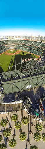
AT&T Park/San Francisco Giants
The AT&T Park/San Francisco Giants example is implemented with basic HTML and JavaScript, no additional tools were used to create this interactive scenario. The content on the left hand side was all laid out with InDesign. The content on the right side is the interactive HTML.

The image used in this example is a vertical panorama captured from a remote control helicopter. This image contains various perspectives that have been composited in Photoshop. The motion of the device is aligned to match the perspectives in the image/viewport; When the device is facing down, the image is looking down and when the device is vertical, the image faces forward. You can check out the vertical panorama image below. If you’re interested in creating a vertical panorama, be sure to check out this tutorial from Russell Brown.
The HTML and JavaScript used in this example is fairly minimal. The image is applied as the background of the root HTML <body> element, and the position of the background is shifted based upon the device motion event. This approach keeps the HTML DOM as flat and simple as possible.
Here’s the HTML that makes up this example:
[html]<html>
<head>
<meta charset="utf-8">
<meta name="viewport" content="initial-scale=1, maximum-scale=1, user-scalable=no">
<title>Parallax Vertical Background</title>
<link rel="stylesheet" href="assets/styles.css">
<script src="assets/zepto.js"></script>
</head>
<body></body>
</html>[/html]
… and the CSS styles used to apply the background image.
[css]body {
background-image:url(‘att_park_vert_panorama.jpg’);
background-position: center;
}[/css]
… and the JavaScript used to shift the position based on the device orientation event. Note: this also uses the Zepto JavaScript library.
[js]window.ondeviceorientation = function(event) {
var gamma = event.gamma/90;
var beta = event.beta/180;
var temp = 0;
// shift values/motion based upon device orientation
switch (window.orientation) {
case 90:
temp = gamma;
gamma = beta;
beta = temp;
break;
case -90:
temp = -gamma;
gamma = beta;
beta = temp;
break;
}
// update positions to be used for CSS
var yPosition = 1200 - (beta * 2200);
var xPosition = -200 + (gamma * 300);
xPosition = Math.max( -300, Math.min( 0,xPosition));
yPosition = -Math.max( 100, Math.min( 1400,yPosition));
//console.log(xPosition, yPosition);
// apply css styles
var css = xPosition + "px " + yPosition + "px";
$("body").css( "background-position", css);
}[/js]
Textual content used in this example from: http://en.wikipedia.org/wiki/At%26t_park
Source code for the device motion in this example is available at: https://github.com/triceam/DPS-HTML-Samples/tree/master/ATT%20Park
All of the HTML, CSS and JavaScript code used for these examples is available in the GitHub repository at: https://github.com/triceam/DPS-HTML-Samples